How to redesign a store from a single photo
What to shoot on the site visit, how to brief the redesign so the architecture survives it, and how to present the before and after without overselling.
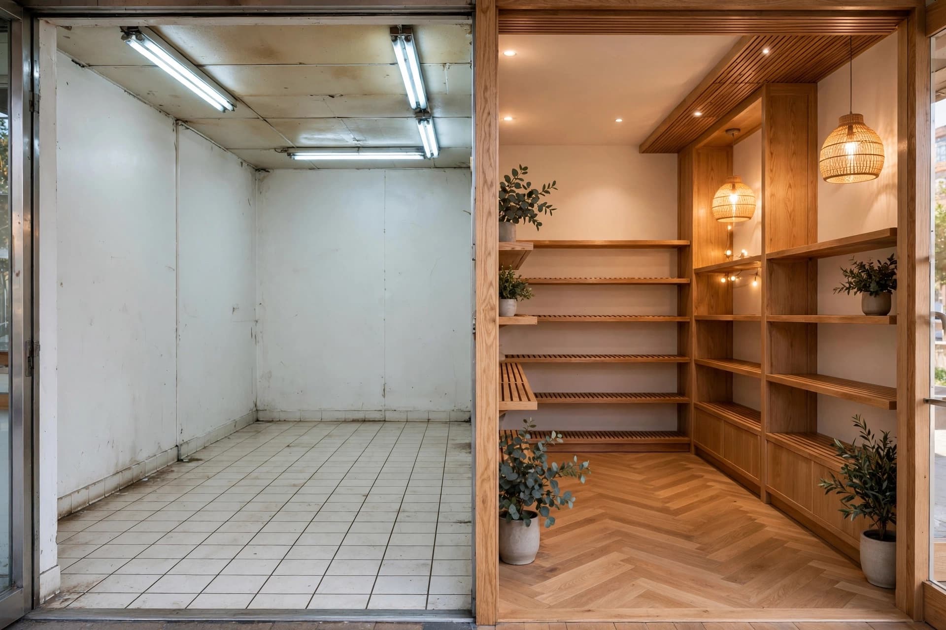
The most persuasive slide in a renovation pitch is the one where the room the client already knows becomes the room you are proposing. No plan, no model, no measurements — one photo and a direction.
Shoot the site properly, once
You will not want to go back, so spend ten extra minutes on the visit:
- Stand in the doorway and shoot the length of the space. This is the frame that will end up in the proposal.
- Shoot the opposite direction from the far end, so you have a reverse angle.
- Keep the camera level at chest height. Tilting up produces converging walls that make the redesign read oddly.
- Turn on every light, and avoid shooting straight into a window — blown-out glazing loses the architecture you want to keep.
- Clear the frame of what is leaving anyway: bins, boxes, sale signage.
Brief the direction, not the demolition
A redesign from a photo keeps the bones — window positions, ceiling height, general geometry — and changes everything else. That is what makes the output credible rather than fantasy. So the brief should be about finishes, fixtures, light and mood:
"Warm minimal refit: micro-cement floor, oak perimeter shelving to 2.2 m, lime-plaster walls in clay, brushed brass rails, warm 2700K light, sand and off-white palette."
If you genuinely want an opening moved or a wall removed, say so explicitly — otherwise the architecture stays where it is, which is usually what you want.
Generate three, not one
Generating four variants of one direction tells you how confident the model is. Generating one variant each of three directions tells you what the project could be. In a first meeting, the second is far more useful — clients choose much better than they describe.
Clean up the one detail that is wrong
There is almost always a single flaw in an otherwise good redesign: a fixture in the walkway, a material that went too glossy, a light that reads cold. Mark it, describe the correct version, regenerate that area only. Rerolling the whole image to fix a table is how good renders get lost.
Present it honestly
Two rules keep this tool from becoming a liability. First, label it: this is a concept visualization, not a construction document, and saying so out loud costs you nothing and protects you later. Second, do not quietly improve the before — if the current space looks worse in your photo than in real life, the comparison is doing the persuading, not the design.
An honest before/after survives the build. A flattering one becomes the client's complaint six months later.